Skip to content

🌿 Nature’s Palette | Found in Nature. Translated for Home. → Explore the Collection

WellHaven Design
  • Home
  • AboutExpand
    • How We Work
    • Areas We Serve
    • FAQ
  • ServicesExpand
    • Design Consultation
    • Design Direction
    • New Construction + Remodel Design Review
    • Professional + Commercial Design
  • Portfolio
  • Blog
  • Contact
  • (904) 913-9696
Get Started
Designing homes with intention.
WellHaven Design

Featured

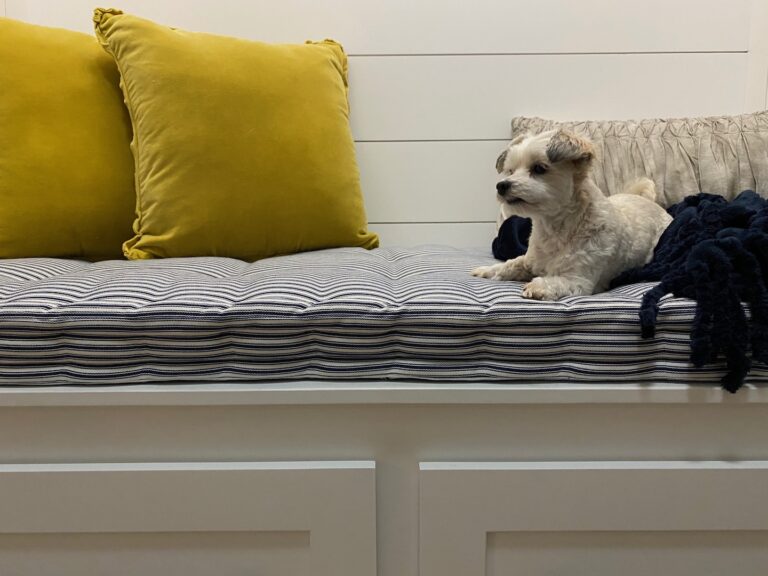
  • Chloe, a white maltipoo, enjoying the built-in custom drop zone.

    A Custom Drop Zone Designed for Everyday Ease

  • Assorted fabric and textile samples with color swatches for design inspiration.

    Biophilic Design in Residential Interiors: Beyond the Buzzword

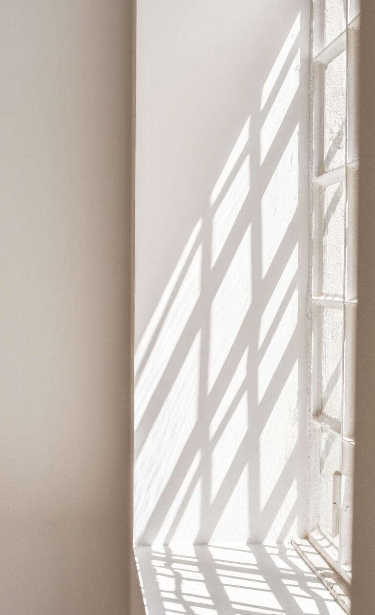
  • Sunlight shining through a window.

    Wellness-Focused Interiors in Design for Everyday Living

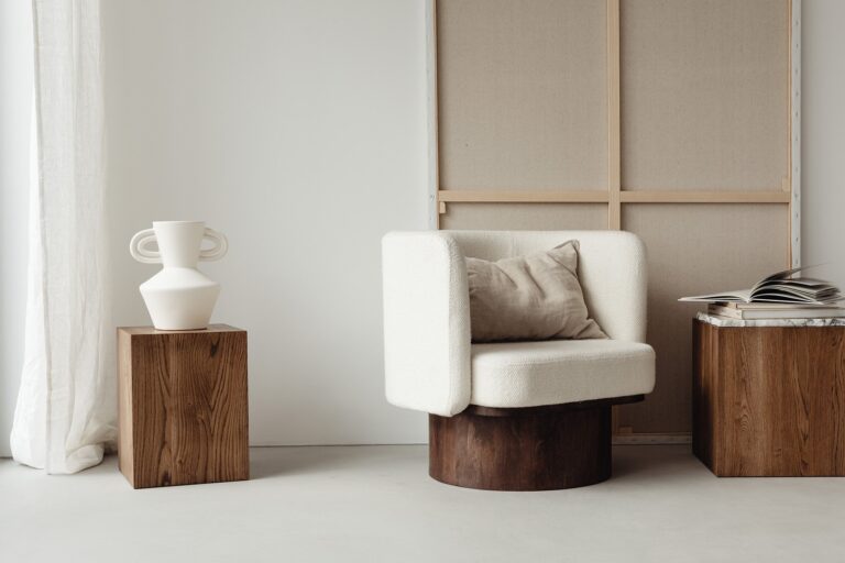
  • Natural light over an upholstered armchair with an open book on a wooden table, cube shaped - an example of wellness-focused design.

    What Wellness-Focused Interior Design Means

Follow Us

Instagram Facebook Pinterest houzz logo
Join The Circle

Sign up for design insights from WellHaven Design.

Info

  • Areas We Serve
  • Contact Us
  • Privacy Policy
  • Terms & Conditions

Explore

  • About Us
  • How We Work
  • Portfolio
  • Services
  • Blog
  • FAQ

Categories

  • Community
  • Design
  • Living
  • Guides
  • All Posts

In-person Service Areas

Remote Design
Services Available

  • Crescent Beach
  • Nocatee
  • Ponte Vedra
  • Ponte Vedra Beach
  • Saint Johns
  • St Augustine
  • St Augustine Beach
  • Vilano Beach

wellhavendesign

Three things I look at before choosing materials: Three things I look at before choosing materials: undertone, visual weight and texture. 

A successful material palette doesn’t require everything to match.

I’m usually looking for a relationship between the finishes: which material carries the most visual interest, what other one supports it, and which material gives the eye a place to rest.

That balance is what keeps a room feeling layered and cohesive without making it feel busy.

🌟 Save this if you’re working through material selections.
Materials Monday | Quiet Cove 🌿 Soft blues, warm Materials Monday | Quiet Cove 🌿

Soft blues, warm wood, woven texture and a little contrast.

Quiet Cove has a coastal influence, but not in an overly coastal way. The palette is built around muted blues and layered neutrals, then grounded with natural wood and deeper contrast.

It’s a combination that can feel calm and relaxed without feeling washed out, and the mix of smooth, woven and tactile materials keeps a softer palette from becoming flat.

This is one of the things I love about working with materials: color is only part of the story. Texture, finish, contrast and the relationship between materials can completely change how a space feels.

Would you use these softer blues in your home?

Quiet Cove | WellHaven Design
Grounded by Nature. Defined by Design.

#MaterialsMonday #WellHavenDesign #InteriorDesign #MaterialPalette InteriorMaterials
Found in Nature. Translated for Home. 🌿 The Natur Found in Nature. Translated for Home. 🌿

The Nature’s Palette Collection is officially live.

This collection grew from something I was already doing: photographing the places, landscapes and details in nature that caught my attention, and then beginning to look at those photographs differently. Not just at the individual colors, but at the relationships between them and what those same relationships could look like translated into a home.

Each palette begins with one of my original photographs. From there, I explore how its colors can translate into paint, materials, finishes and textures for an interior.

And there’s a lot more coming. I have five material palettes in progress right now and plenty more photographs waiting their turn. 😊

You can explore the Nature’s Palette Collection and the Color + Material Guides through the link in my bio.

🌿 wellhavendesign.com

#naturespalette
#natureinspireddesign 
#interiordesign 
#staugustineinteriordesigner 
#biophilicdesign
Materials Monday | Golden Hour Warm, grounded and Materials Monday | Golden Hour

Warm, grounded and quietly refined.

Golden Hour pairs a creamy countertop, natural wood and soft woven textures with restrained warmth. Each material brings something different to the palette, but together they create a space that feels cohesive.

It’s a good reminder that warmth doesn’t have to mean warm everything. The contrast of lighter neutrals, deeper natural tones and subtle variation in texture is what gives the palette depth.

A little inspiration for your Monday, and perhaps your next room. 🌿

#MaterialsMonday #staugustineinteriordesign #MaterialPalette #InteriorDesign #NaturalMaterials

  • Privacy Policy
  • Terms & Conditions

© 2026 WellHaven Design. All rights reserved. Theme by 17th Avenue.

Scroll to top
  • Home
  • About
    • How We Work
    • Areas We Serve
    • FAQ
  • Services
    • Design Consultation
    • Design Direction
    • New Construction + Remodel Design Review
    • Professional + Commercial Design
  • Portfolio
  • Blog
  • Contact
  • (904) 913-9696
Instagram Facebook Pinterest TikTok Linkedin
Get Started
What are you looking for?
Search